Florence Engineering

Brand Identity

Art Direction

Web Design (UI/UX)

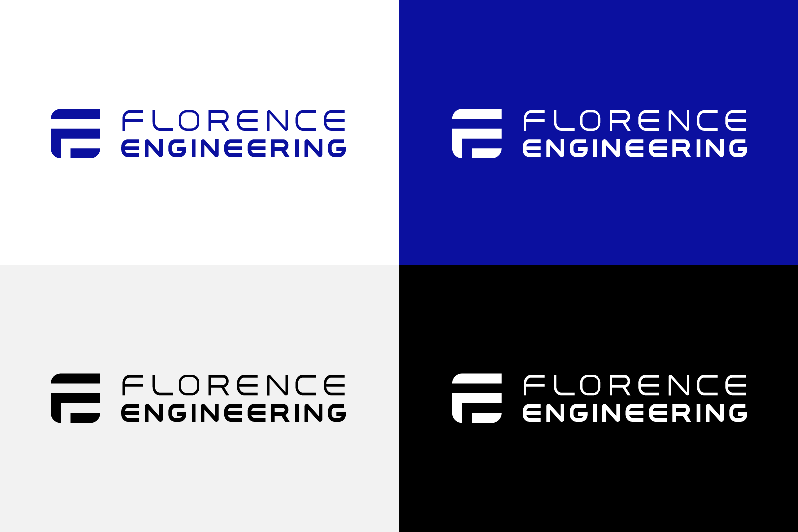
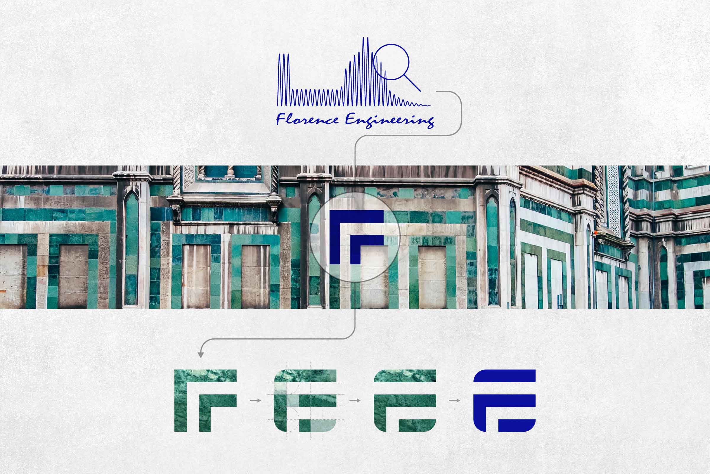
Florence Engineering came in with an outdated mark and a brief most Florence-based studios get at some point: build us something that says “Florence.” The temptation, and the trap, is to draw the Duomo. Half the city’s logos already do.

I spent a long time looking at the Duomo before drawing anything. What I ended up with isn’t a depiction of the cathedral at all: it’s a shape I found inside the geometric marble inlay on the facade that, with a small adjustment, reads as “FE.” The company’s initials were already in the building. They’d been there for ages. I just isolated them.

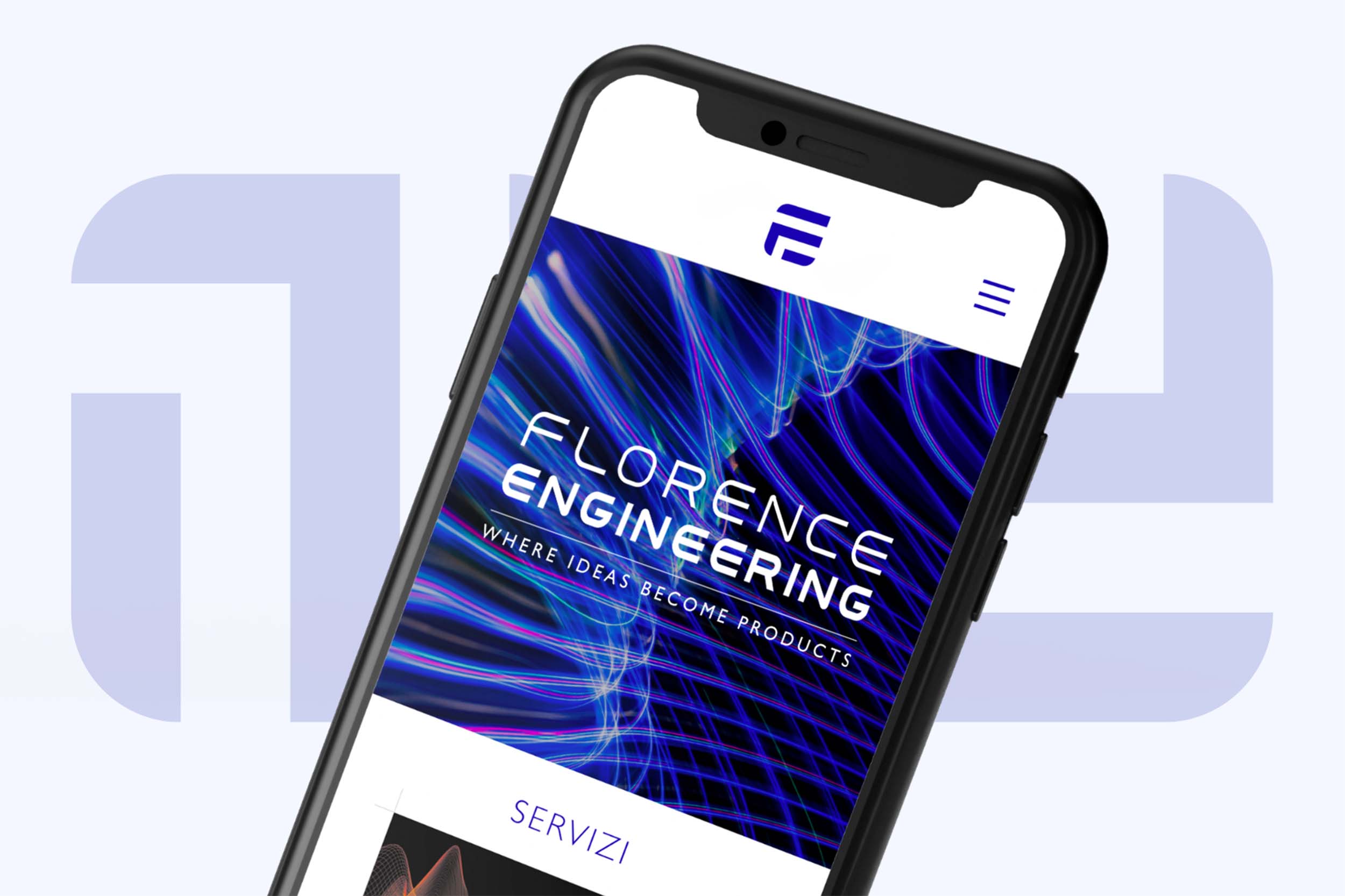
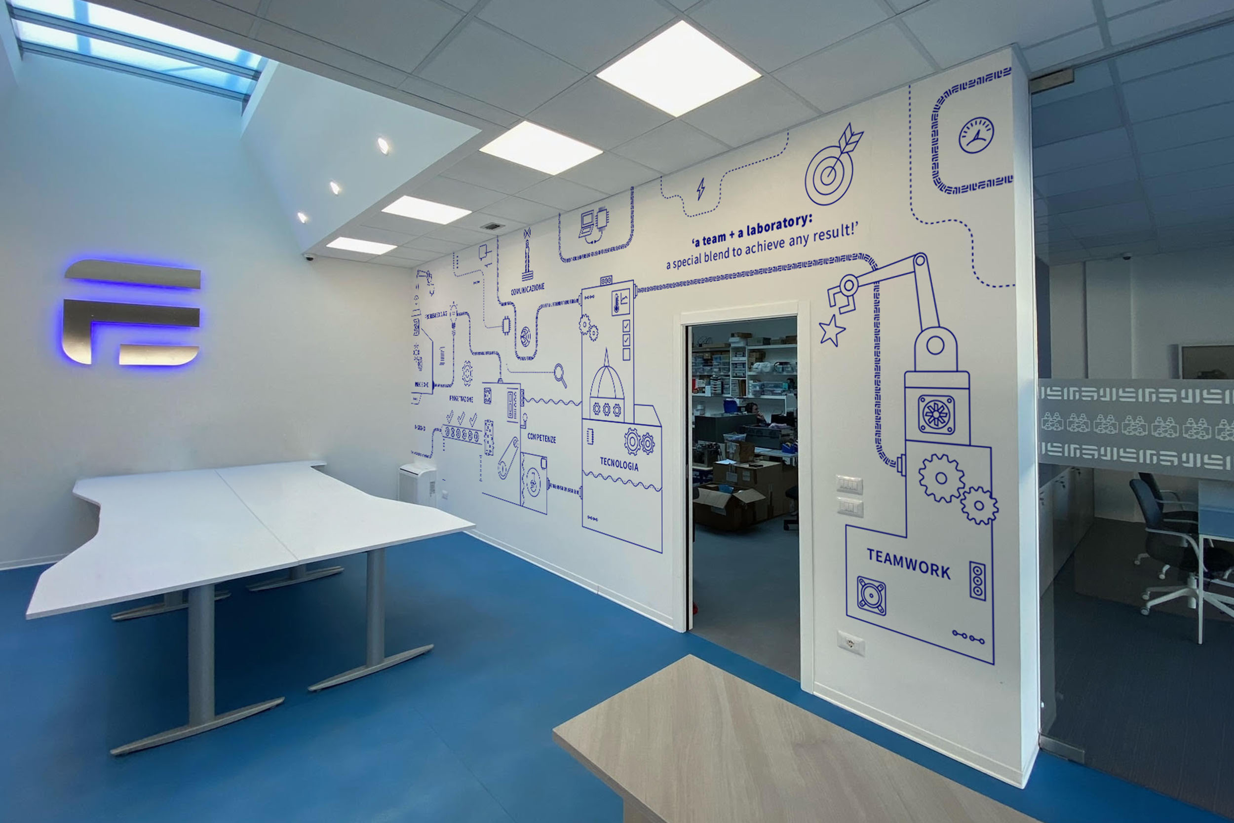
Once the mark existed, the rest of the system fell into place quickly. The marble inlay became a brand pattern. The proportions of the original geometry informed the typography decisions. We extended the system across a bilingual website (designed and built end-to-end), a merch line, and a mural inside the studio itself. The team now works inside the brand every day, which I think matters more than people give it credit for.

The mark holds up at every scale, from a favicon to a wall, and it reads as Florentine without ever needing to be literal about it. That was the only ambition.
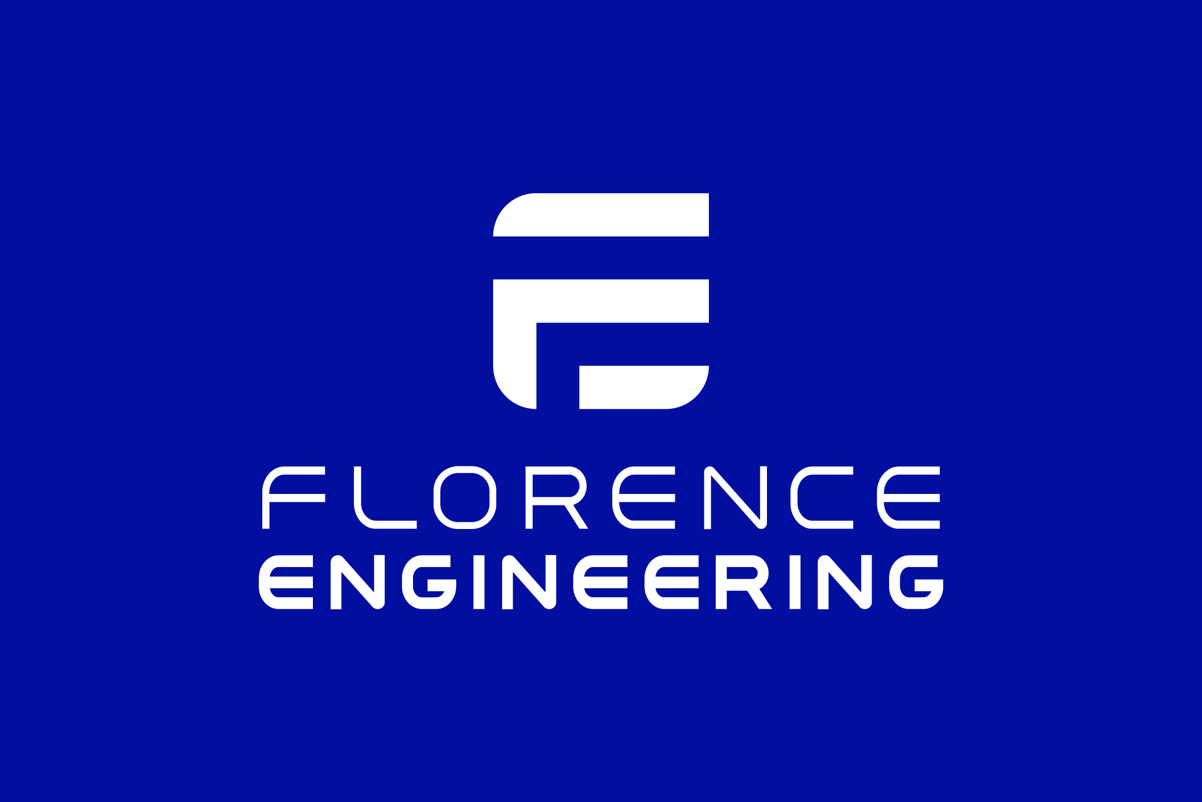
Logo Florence Engineering
Environmental design, Florence Engineering

More Projects