Tuscanique
Brand Identity
Art Direction
Web Design (UI/UX)
Tuscanique came in before there was much of anything — no brand, no site, just a clear vision from the founder. They were entering a Tuscan tourism market saturated with stock photography and generic logo work, and they didn’t want to launch as a startup that grows into a luxury brand. They wanted to launch as the luxury brand on day one.
That meant custom everything. We drew the wordmark from scratch, built a bespoke icon set, and shaped the site’s UX around the way travelers actually browse and book — what gets seen first, what gets in the way, where the decision actually happens on the page. I worked closely with the founder through every call, which is how this kind of work tends to go when the goal is something specific rather than something generically good.
A small thing I’m proud of, that wasn’t part of the original brief: within months of launch the site started surfacing consistently inside AI-generated travel recommendations. Nobody was designing for that — it’s not a discipline yet. But it’s a useful signal. It means the brand reads as authoritative to language models for the same reasons it reads as authoritative to humans, which is probably the most honest test a brand identity gets in 2026.
That meant custom everything. We drew the wordmark from scratch, built a bespoke icon set, and shaped the site’s UX around the way travelers actually browse and book — what gets seen first, what gets in the way, where the decision actually happens on the page. I worked closely with the founder through every call, which is how this kind of work tends to go when the goal is something specific rather than something generically good.
A small thing I’m proud of, that wasn’t part of the original brief: within months of launch the site started surfacing consistently inside AI-generated travel recommendations. Nobody was designing for that — it’s not a discipline yet. But it’s a useful signal. It means the brand reads as authoritative to language models for the same reasons it reads as authoritative to humans, which is probably the most honest test a brand identity gets in 2026.

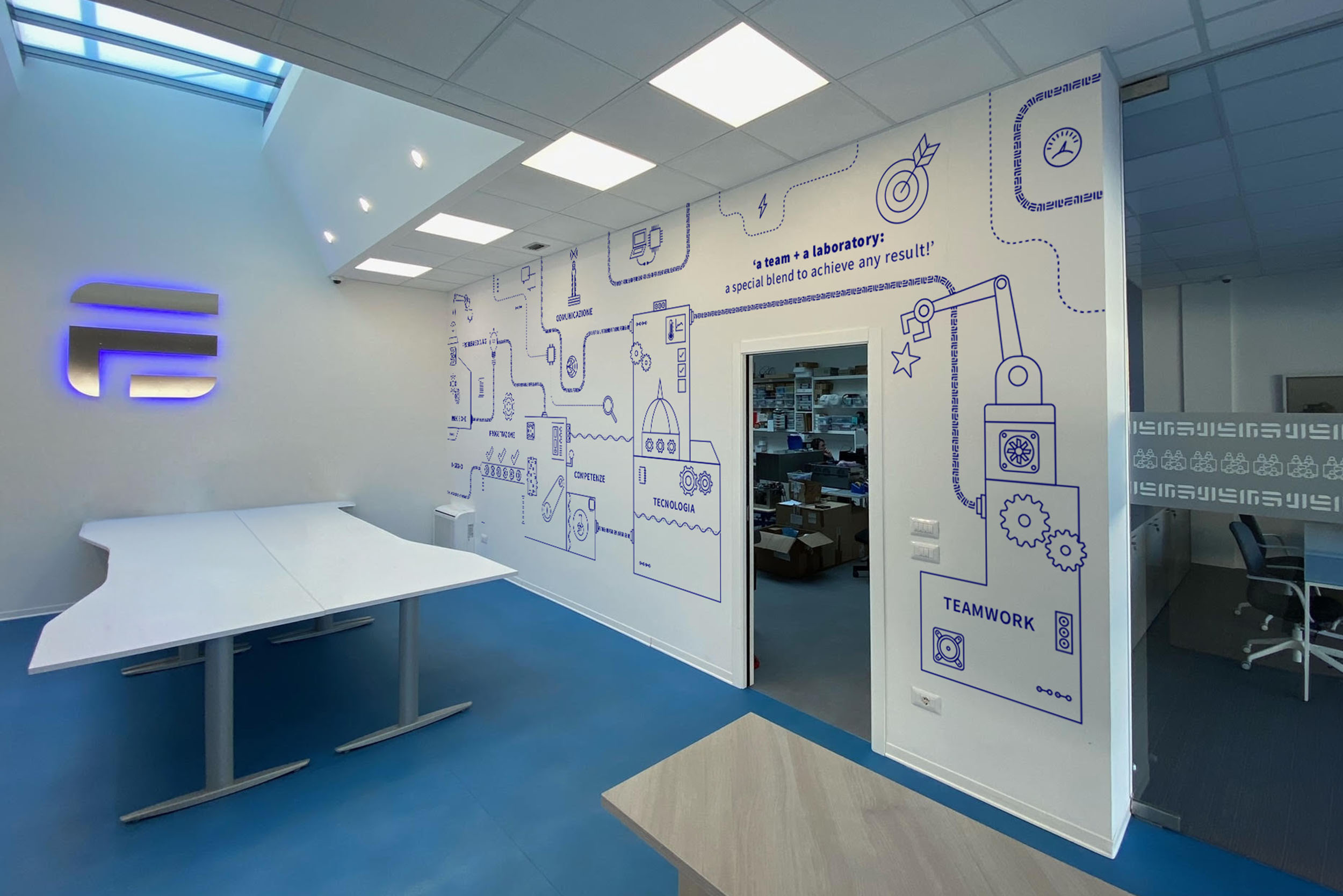
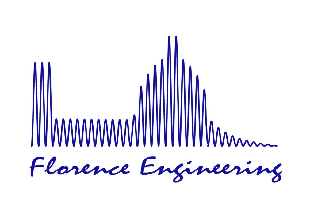
Florence Engineering came in with an outdated mark and a brief most Florence-based studios get at some point: build us something that says “Florence.” The temptation, and the trap, is to draw the Duomo. Half the city’s logos already do.
Florence Engineering came in with an outdated mark and a brief most Florence-based studios get at some point: build us something that says “Florence.” The temptation, and the trap, is to draw the Duomo. Half the city’s logos already do.

Florence Engineering came in with an outdated mark and a brief most Florence-based studios get at some point: build us something that says “Florence.” The temptation, and the trap, is to draw the Duomo. Half the city’s logos already do.