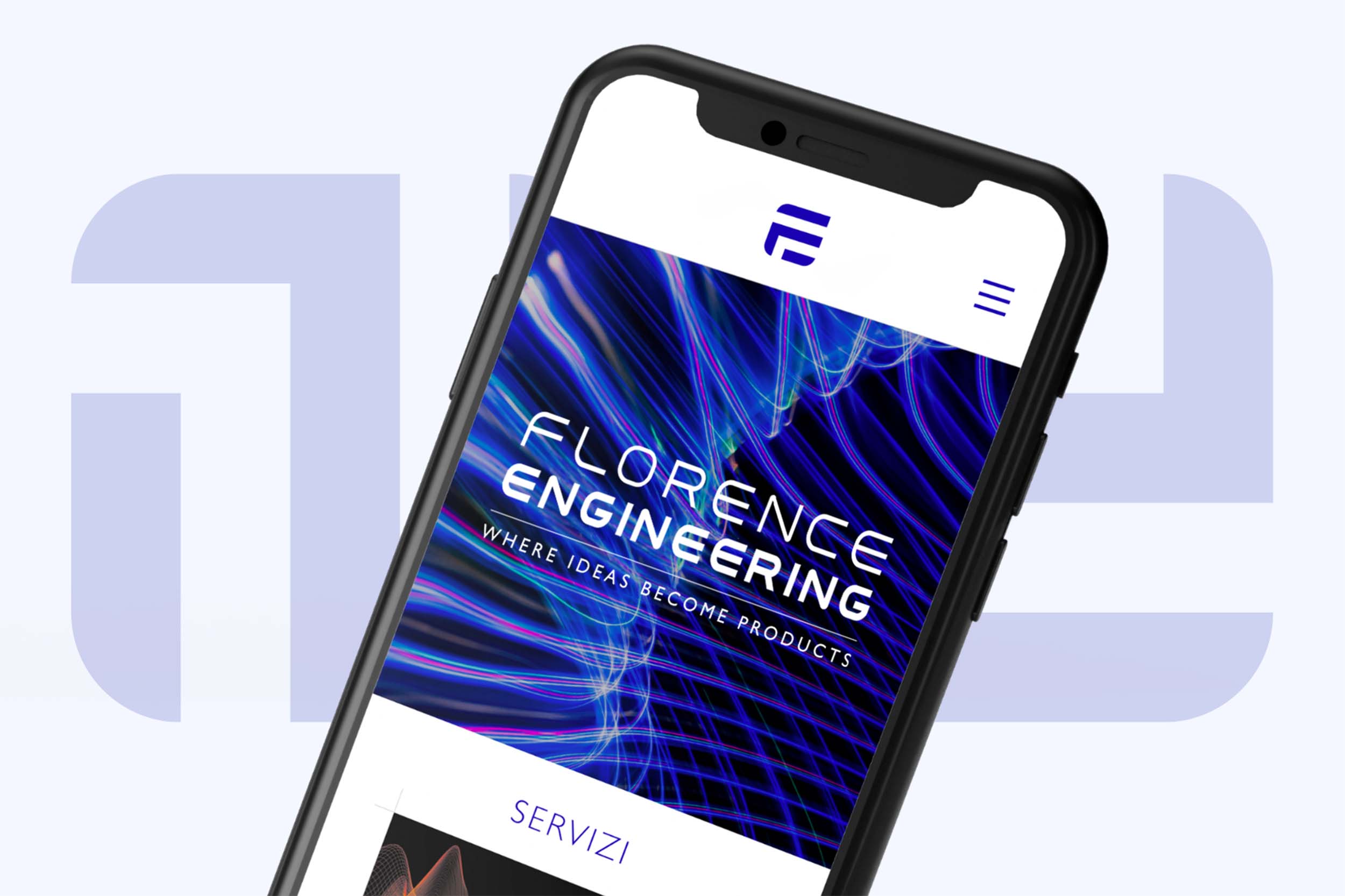
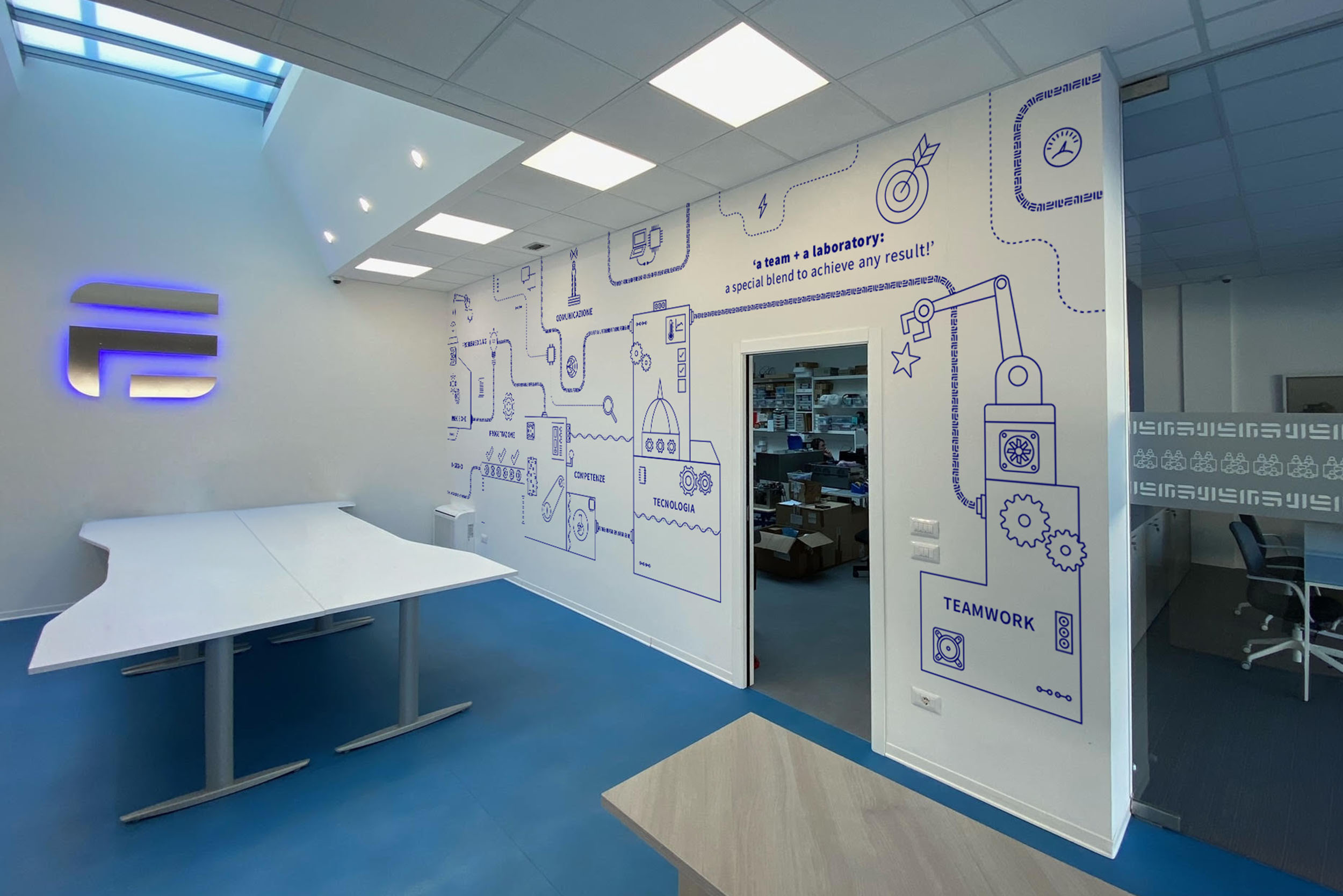
Once the mark existed, the rest of the system fell into place quickly. The marble inlay became a brand pattern. The proportions of the original geometry informed the typography decisions. We extended the system across a bilingual website (designed and built end-to-end), a merch line, and a mural inside the studio itself. The team now works inside the brand every day, which I think matters more than people give it credit for.
The mark holds up at every scale, from a favicon to a wall, and it reads as Florentine without ever needing to be literal about it. That was the only ambition.