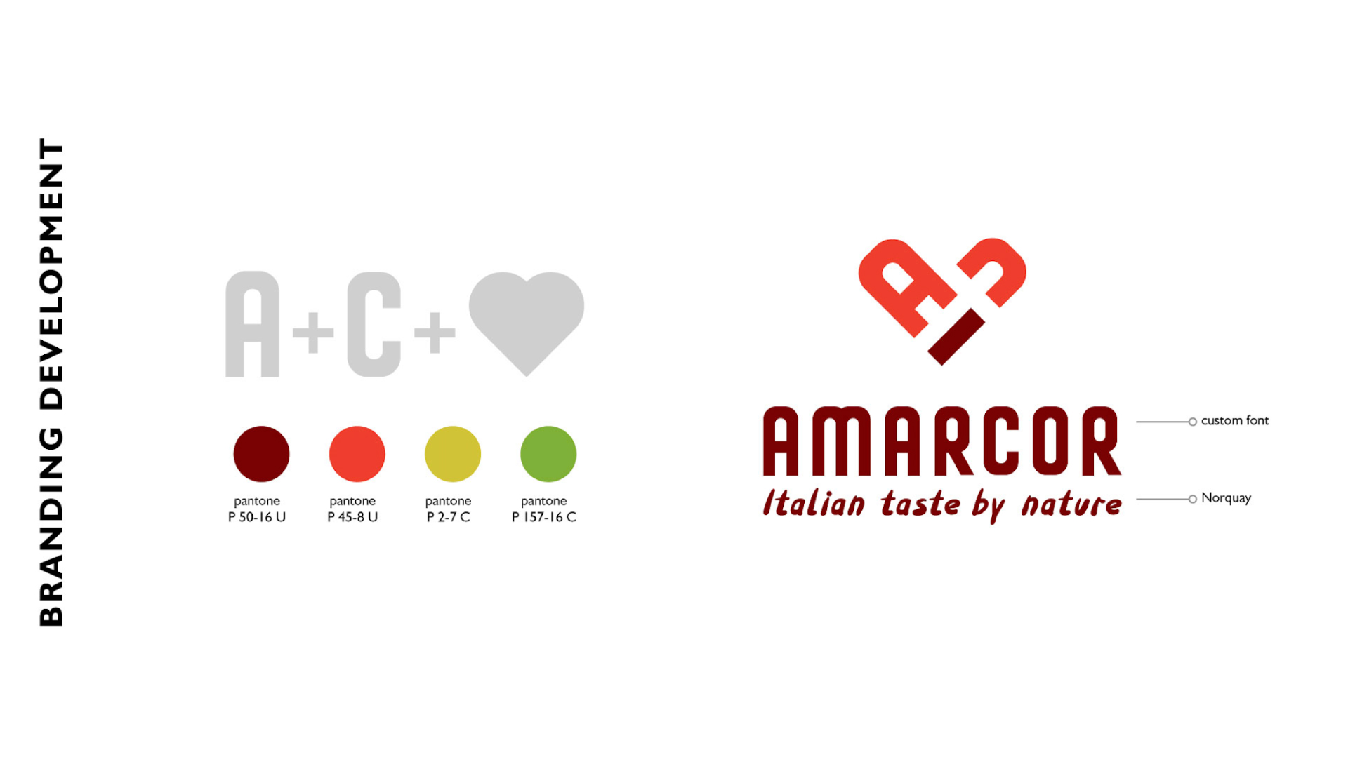
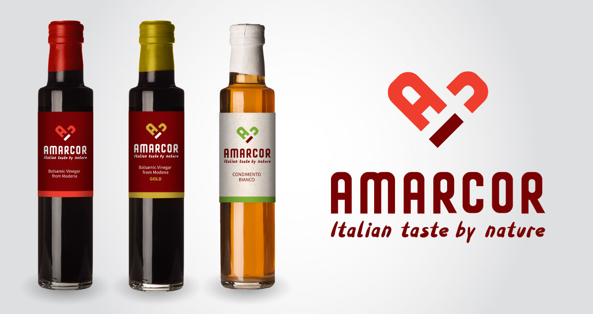
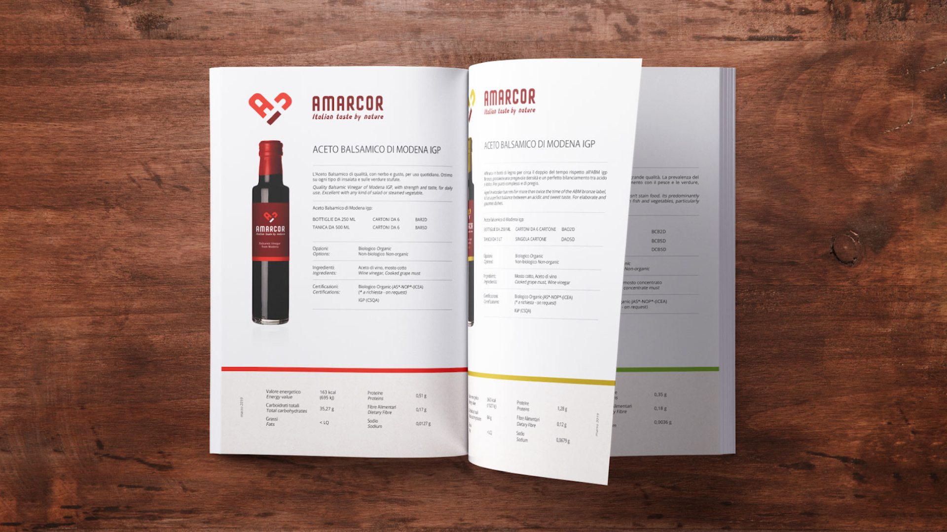
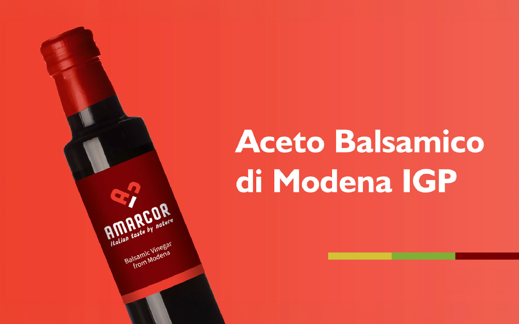
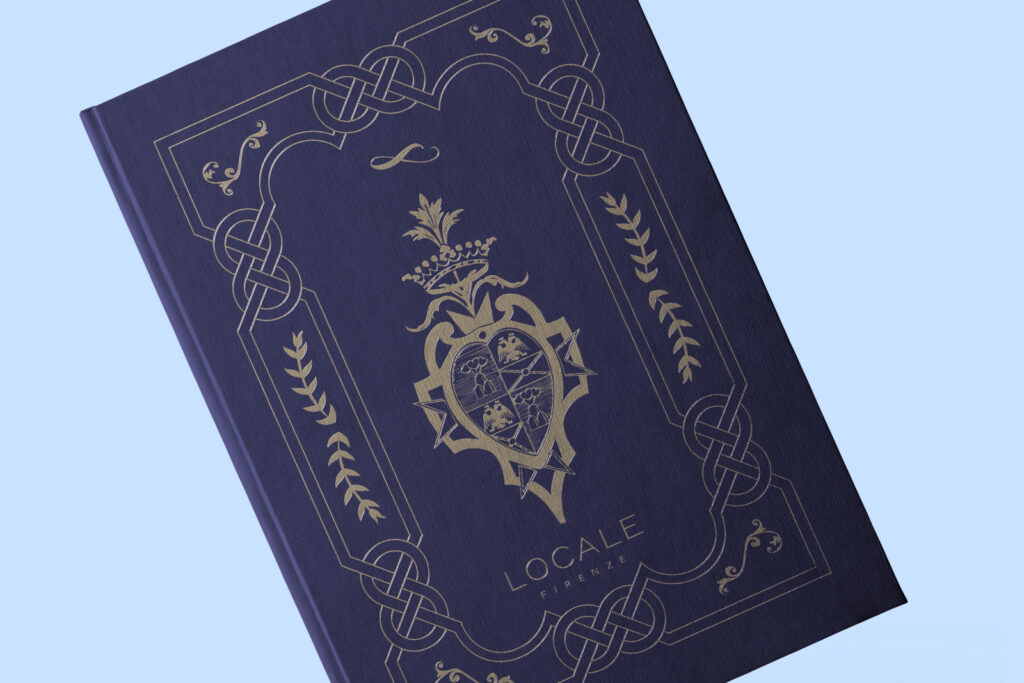
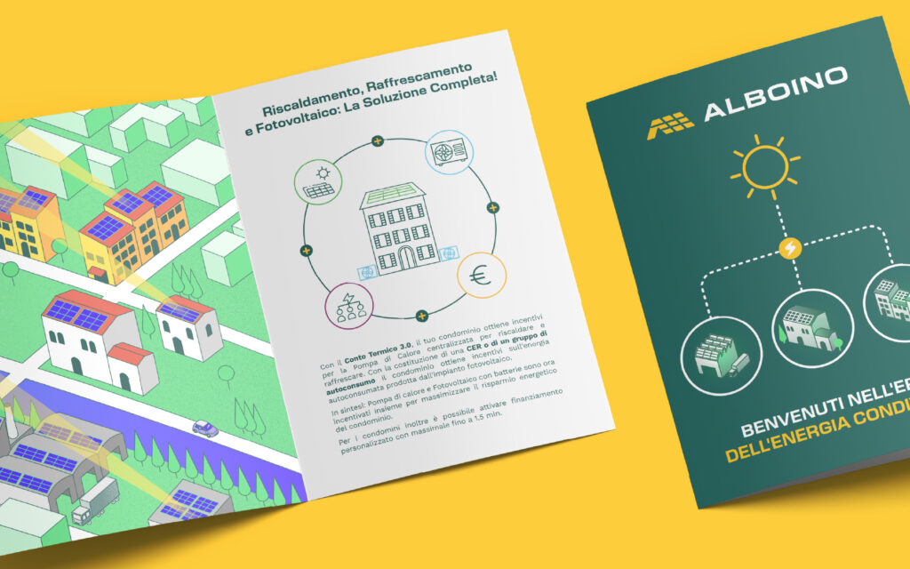
With the logo and brand foundations in place, I moved on to packaging and the printed catalog — extending the same type, color, and tone across labels, bottle details, and pages, so the product on the shelf and the story on paper feel like they come from the same hand.
The result is a brand that carries its Italian identity naturally, through name, type, and color, rather than through the gold foil and heraldry so much of the category defaults to.